The default Ultimate Member login page does its job. Users can enter their email and password, click the button, and get in. But visually, it’s bare. A plain white form on a plain white page, with no connection to your site’s brand, colors, or typography.
For most membership sites, the login page is one of the most frequently visited pages on the entire site. Every returning member sees it. It’s often the first thing a new user encounters after registering. Yet it gets almost no design attention because customizing it traditionally meant writing CSS or worse, overriding PHP templates in a child theme.
This guide shows you how to style the Ultimate Member login page directly inside Elementor, without any CSS or code.
What You’ll Need
- WordPress
- Ultimate Member
- Elementor
- Elementor Widgets for Ultimate Member — free plugin, includes the Login Page Styler
The Login Page Styler widget is included in the free version of the plugin. No upgrade required.
What the Default Login Page Looks Like
When you install Ultimate Member, it creates a Login page automatically and assigns the [ultimatemember form=ID] shortcode to it. The result is a centered form with the Ultimate Member default styling functional, but completely generic.
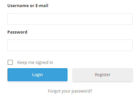
There’s no brand identity. No logo. No background. The button uses UM’s default blue. The form container has a thin border and minimal padding. On a professionally designed site, this page stands out in the wrong way.
What You Can Style with Elementor
Once you drop the Login Page Styler widget onto an Elementor page, every visual element of the login form becomes configurable from the Elementor panel:
- Form container: background color or image, border style and radius, padding, box shadow, maximum width
- Logo area: add your site logo above the form, control its size and spacing
- Heading and subheading: custom welcome text above the form, with full typography controls
- Input fields: background, border color, border radius, focus state color, text and placeholder typography
- Labels: font size, weight, color, spacing
- Login button: background color, hover color, border radius, padding, font size and weight
- “Remember Me” and “Forgot Password” links: color, typography, visibility
- Page background: solid color, gradient, or full background image with overlay
- Layout: center-aligned, left-aligned, or split-screen with a background image on one side and the form on the other
Step-by-Step: Styling the Ultimate Member Login Page
Step 1: Install the Plugin
If you haven’t already, download Elementor Widgets for Ultimate Member from WordPress.org and install it. Go to Plugins → Add New → Upload Plugin, upload the zip file, and activate it.
The plugin works alongside your existing Ultimate Member installation it doesn’t replace or modify how UM handles authentication. It only changes the visual presentation of the login page.
Step 2: Edit the Login Page with Elementor
In your WordPress dashboard, go to Pages. Find your Ultimate Member Login page it was created automatically when you installed UM, usually titled simply “Login.”
Click Edit with Elementor. The current page likely just shows a shortcode block in the Elementor canvas. That’s fine you’re going to replace this with the styled widget.
Step 3: Clear the Existing Shortcode Block
Delete the existing shortcode block or text widget that contains [ultimatemember form=ID]. The Login Page Styler widget renders the login form itself you don’t need the shortcode separately.
Step 4: Set the Page Layout
Before adding the widget, set the page layout to remove the header, footer, or sidebar if your design calls for a full-page login experience.
Click the hamburger menu in the top left of the Elementor editor → Page Settings (or click the gear icon at the bottom left). Under Page Layout, choose Elementor Full Width or Elementor Canvas depending on whether you want to keep the site header.
Many membership sites use a full-canvas login page no header, no footer, just the login form centered on the page. This is cleaner and removes distractions.
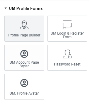
Step 5: Add the Login Page Styler Widget
In the Elementor widget panel on the left, search for “Login” or scroll to the Ultimate Member section. Find the UM Login Styler widget and drag it onto the canvas.
The widget immediately renders the actual Ultimate Member login form not a placeholder. What you see in the editor is what your users will see on the live page.
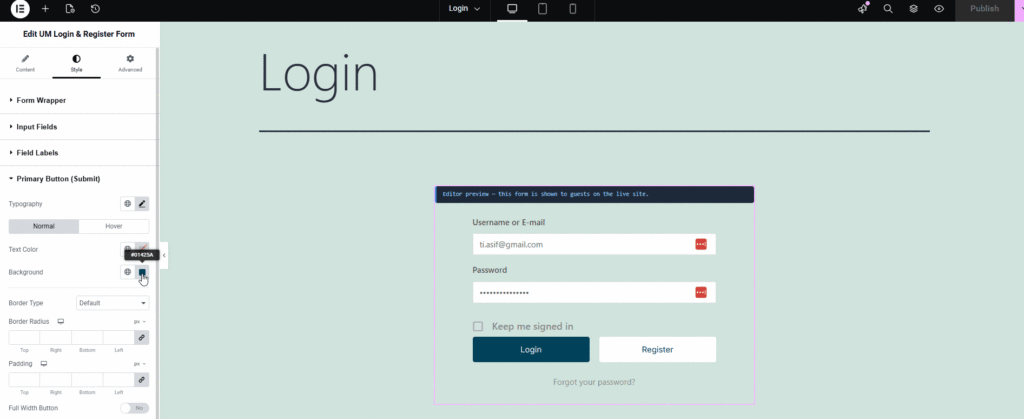
Step 6: Style the Form Container
Click the widget to select it, then click the Style tab in the Elementor panel.
Start with the form container this is the white box that holds the form. For most sites, you’ll want to:
- Set a slightly off-white or light background (pure white on white page backgrounds tends to disappear)
- Add a subtle border radius (8–12px gives a modern, card-like appearance)
- Add a box shadow to lift the form off the page
- Increase the padding so the form doesn’t feel cramped inside its container
A card-style container with padding of around 40px on desktop reads as professional and intentional. Compare this to the default UM form which has minimal padding and no shadow.
Step 7: Add a Logo Above the Form
In the Content tab of the widget settings, enable the logo option and upload your site logo or icon. Set the maximum width to something reasonable typically 60–100px for an icon or 120–160px for a full wordmark.
This single change adding your brand mark above the form immediately makes the login page feel like part of your product rather than an afterthought.
Step 8: Customize the Welcome Text
Still in the Content tab, add a heading above the form. Something like “Welcome back” or “Sign in to your account” is more inviting than presenting a bare form with no context.
You can also add a subheading a one-line description of your community or platform. For a membership community: “Join the conversation → [link to registration page].” This gives users who landed on the wrong page a path forward.
Step 9: Style the Button
The default Ultimate Member login button uses UM’s brand blue. Unless your site’s brand color happens to be that same blue, this creates a visual inconsistency.
In the Style tab, find the Button controls. Set the background color to your brand’s primary color. Set the hover state to a slightly darker shade. Adjust the border radius to match your overall design system if your site uses 6px border radius throughout, use 6px here too.
Consistency in border radius and button styling across a site is one of the easiest ways to make a site look designed rather than assembled.
Step 10: Set the Page Background
Select the section (not just the widget) and go to the section’s Style tab. Here you can set the page background behind the form container.
Options that work well:
- Solid color: A dark background (navy, charcoal, deep green) with a white card form creates strong contrast and a premium feel. Light gray backgrounds with white cards are subtler and blend well with most brand styles.
- Gradient: A two-color gradient from your brand’s primary to secondary color behind the form is a common pattern for SaaS and community platforms.
- Background image: A high-quality photo relevant to your community a workspace, a team, a landscape with a semi-transparent dark overlay so the form remains readable. Set the overlay opacity to around 60–70%.
- Split layout: Add a two-column section. Put a full-height background image in the left column and the login form in the right column. This is popular for professional membership and course sites.
[Screenshot: Split-screen login page with background image on left and styled form on right]
Step 11: Check Mobile Responsiveness
Click the mobile icon at the bottom of the Elementor editor to switch to mobile view. The form should stack to full-width on small screens. Check that:
- Padding doesn’t make the form too narrow
- Font sizes are readable
- The button is large enough to tap comfortably (minimum 44px height)
- Any background image doesn’t obscure the form on small screens
Adjust mobile-specific spacing in Elementor’s responsive controls.
Step 12: Publish and Test
Click Publish (or Update if the page was already published). Open the live login page in an incognito browser window and test:
- The form renders correctly
- Logging in with a test account works
- “Forgot password” link works
- “Remember me” checkbox works
- The page looks correct on both desktop and mobile
[Screenshot: Final styled login page on desktop] [Screenshot: Final styled login page on mobile]
Design Patterns That Work Well
The centered card: White or light card, centered on a colored background, logo above the form, single strong CTA button. Clean and universally effective.
The split screen: Full-height background image on the left (community lifestyle photo, abstract gradient), form on the right. Common on professional membership platforms and course sites.
The branded dark: Dark background in your brand color, white form container with subtle shadow, colored button. Creates a premium, app-like feel. Works especially well for SaaS-adjacent membership communities.
The minimal: Remove all container styling just the form floating on a light gray page background. No card, no border, no shadow. Works for design-forward sites that value whitespace.
The CSS Alternative
If you prefer not to install an additional plugin, you can customize the Ultimate Member login page appearance using CSS in your child theme or via Appearance → Customize → Additional CSS.
Ultimate Member uses fairly consistent class names. The main form container is .um-form, input fields are .um-form-field input, and the submit button is .um-button.
This approach works but has limitations: you can’t add a logo above the form, you can’t change the page background easily, and every change requires writing and testing CSS rather than using visual controls.
For most Elementor users, the widget approach is faster and gives more design flexibility with no code.
Connecting the Login Page to the Rest of Your UM Flow
Once your login page is styled, make sure the surrounding pages are consistent.
Registration page: If the login page looks polished but the registration page still uses the default UM style, users will notice the inconsistency. Write the registration page next using the same layout and design approach same background, same card style, same button styling. (See our guide: How to Customize the Ultimate Member Registration Page with Elementor.)
Password reset page: UM creates a password reset page automatically. Style this one too it’s often forgotten and creates a jarring experience when a user tries to reset their password and lands on the bare default page.
Redirect after login: In Ultimate Member → Settings → General → Login, set the redirect URL to wherever you want users to go after logging in. If you’ve built a dashboard or member home page, point it there. Don’t leave users on the login page after authenticating.
Frequently Asked Questions
Will this affect how Ultimate Member handles authentication? No. The Login Page Styler widget only changes the visual presentation of the form. Ultimate Member still handles all authentication logic login, session management, redirects, and error messages.
Does this work with Ultimate Member extensions? Yes. If you’re using UM extensions that add elements to the login flow (such as social login), those elements will still appear on the styled page.
Can I add a custom background image that’s different for the login page only? Yes. Because you’re editing the login page in Elementor, the background settings apply only to that page. Your site’s other pages are unaffected.
Do I need Elementor Pro? No. The Login Page Styler widget works with the free version of Elementor.
What if I don’t see the Login Styler widget in Elementor? Make sure both the Elementor Widgets for Ultimate Member plugin and Ultimate Member are active. If you’ve just installed the plugin, refresh the Elementor editor. If the widget still doesn’t appear, check that your WordPress user has the Administrator role.
The Ultimate Member login page doesn’t have to look like a default WordPress form. With the Elementor Login Page Styler widget, you can match the login experience to the rest of your site design in under an hour no CSS, no child theme, no PHP.
The steps in short: install the free plugin → open your login page in Elementor → replace the shortcode block with the Login Styler widget → style the container, button, background, and typography → publish.
Download Elementor Widgets for Ultimate Member — free on WordPress.org →
Related Guides
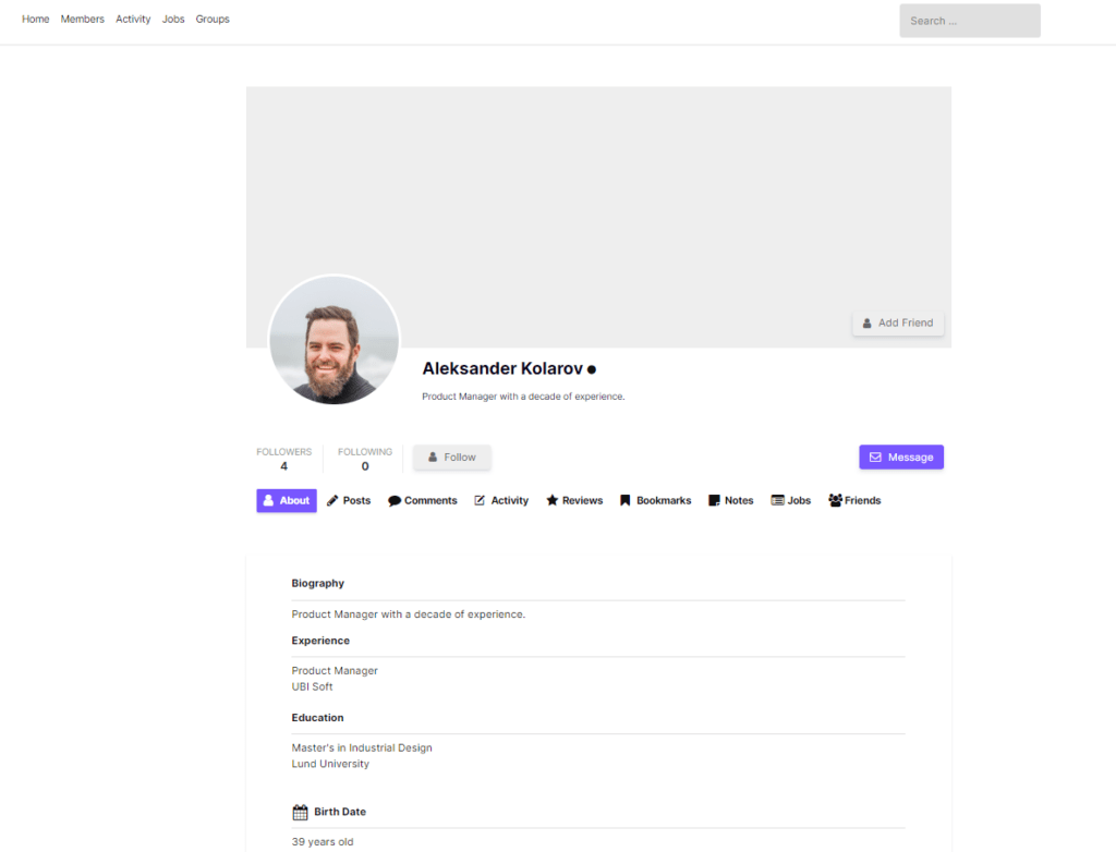
- How to Customize the Ultimate Member Profile Page (Elementor & PHP Methods)
- How to Customize the Ultimate Member Registration Page with Elementor
- How to Make Ultimate Member User Profiles Private by Default
- The Complete List of Ultimate Member Shortcodes
- How to Build an Ultimate Member Member Directory with Elementor